
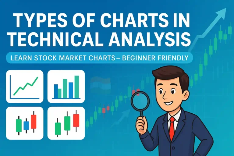
Technical analysis is a method used by traders and investors to understand stock price movements using historical data. One of the most important tools in technical analysis is the price chart. A chart shows how a stock’s price has moved over time and helps people make better trading decisions.
If you are new to stock market investing, learning about chart types is a great first step. In this blog post, we’ll explain the main types of charts used in technical analysis with easy examples, including from the Indian stock market such as Nifty 50, Infosys, or Reliance.
Why Charts Matter in the Stock Market
Charts are used to visually represent the movement of stock prices. Instead of reading long numbers, traders look at charts to:
- Spot trends (is the stock going up or down?)
- Identify entry and exit points
- Predict possible price movements
- Understand support and resistance levels
Charts are helpful for both short-term traders and long-term investors. Whether you are trading intraday or investing for months, chart reading can improve your results.
Main Types of Charts in Technical Analysis
Let’s look at the 3 most common chart types:
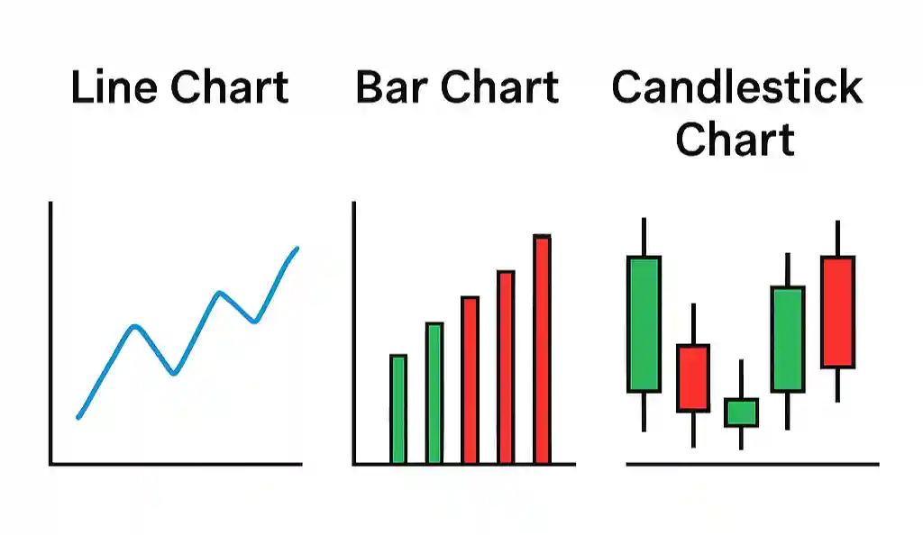
1. Line Chart
A line chart is the simplest and easiest chart to understand. It connects the closing prices of a stock over time using a line.
Features:
- Shows only the closing price
- Good for beginners
- Best for identifying long-term trends
Example:
If you check the Nifty 50 line chart for the last 6 months, you can see if the market is in an uptrend (prices rising) or downtrend (prices falling). It gives you a clean view of the market’s direction.
2. Bar Chart
A bar chart shows more details than a line chart. Each bar represents one time period (like one day) and shows:
- Open price (where the stock started)
- High price (the highest point)
- Low price (the lowest point)
- Close price (where it ended)
These are often called OHLC charts.
Features:
- Gives detailed price information
- Useful for spotting volatility
- Better for intermediate-level traders
Bar charts help you see how much a stock moved during the day and whether it closed higher or lower than it opened.
3. Candlestick Chart
The candlestick chart is the most popular and widely used chart among traders. It’s colorful, visual, and gives detailed information in an easy-to-understand format.
Each candle shows:
- Open, High, Low, and Close prices
- Color indicates direction:
- Green/White = price went up
- Red/Black = price went down
Candlestick Patterns:
Traders use specific shapes to predict price movement. Some common patterns are:
- Hammer – could mean a reversal to the upside
- Doji – signals market uncertainty
- Engulfing – shows strong reversal potential
Example:
If you see a “Hammer” candle in the Infosys stock chart after a downtrend, it may indicate a reversal and a possible upward move.
Which Chart is Best for Beginners?
If you are just starting:
- Begin with the line chart to understand overall trends.
- Then move to candlestick charts to learn patterns and price behavior.
You can use free platforms like:
- TradingView – Free, powerful, and beginner-friendly.
- Zerodha Kite – Great for Indian stock traders.
- Groww – Simple interface, easy for mobile users.
Choose a time frame depending on your goal:
- Daily chart for short-term trading
- Weekly/Monthly chart for long-term investing
Conclusion
Understanding the different types of charts is the first step in learning technical analysis. Whether you are trading Indian stocks like HDFC Bank or tracking indices like Nifty 50, charts can help you make smarter decisions.
Start simple, be consistent, and practice regularly. With time, you’ll be able to spot trends and patterns that others miss.